ThemeForge
Design system generator that creates cohesive Tailwind themes from a single brand color using color science.
ThemeForge: One Color In. A Complete Design System Out.
The Problem
Color is the foundation of every design system — and getting it right is deceptively hard.
When a team starts building a design system, this is what typically happens:
-
A designer picks a brand color
Maybe it’s a nice blue. It looks great on a hero banner, but it’s just a single point in a much bigger system. -
They need a full palette
Suddenly that one blue has to become a 10-step scale (50–950) for backgrounds, surfaces, borders, text, and interactive states. Most teams start nudging HSL sliders, eyeballing brightness and saturation. The result is guesswork, not a system. -
Dark mode doubles the work
Every color needs a dark-mode counterpart that preserves hierarchy and contrast. In practice, teams ship 2–3 broken iterations before they get something passable — and even then, it often feels like a separate, bolted-on theme. -
Contrast ratios are math, not vibes
WCAG 2.1 requires 4.5:1 contrast for normal text and 3:1 for large text. Manually checking every foreground/background combination is tedious, error-prone, and usually skipped until QA — or worse, until an accessibility audit. -
Semantic tokens add another layer of complexity
Raw colors have to be mapped to semantic roles: primary, secondary, accent, success, warning, error, info, muted, subtle, etc. That mapping requires design judgment, accessibility awareness, and careful implementation across design and code. -
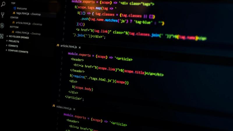
Tailwind config is the final boss
Even once the palette is “done,” someone has to translate it into a cleantailwind.config.ts:- Properly named scales (
primary-50…primary-950) - CSS custom properties for runtime theming
- Dark mode variants
- Semantic utilities that match the design language
This alone can take hours and is easy to get wrong.
- Properly named scales (
For an experienced designer or design engineer, the full process takes 8–20 hours per design system — and the outcome is often:
- Colors that look good in Figma but fail contrast checks in implementation
- Dark mode palettes that feel like an afterthought instead of a first-class experience
- Inconsistent visual weight across hues, especially when using HSL-based tools
Underneath all of this is a deeper technical problem: most color tools are built on HSL, which is not perceptually uniform.
- Two colors with the same HSL lightness can look dramatically different in brightness.
For example,hsl(60, 100%, 50%)(yellow) appears much brighter thanhsl(240, 100%, 50%)(blue), even though their lightness values are identical. - This means HSL-based palettes produce unpredictable visual weight across hues — yellows scream, blues whisper, and designers are left compensating by hand.
Teams are trying to build rigorous, scalable design systems on top of a color model that was never designed for perceptual consistency.
The Solution: ThemeForge
ThemeForge generates a complete, production-ready design system color palette from a single hex code — using OKLCh color science for perceptually uniform results that feel handcrafted, not algorithmic.
How It Works
-
Paste one color
Start with your brand’s primary hex code. That’s it. One input. -
ThemeForge generates a full, system-ready palette:
-
10-shade primary scale (50–950)
Built in OKLCh so each step has visually uniform lightness increments. The scale is tuned for real UI use: subtle backgrounds, solid fills, borders, text, and interactive states. -
Complementary and analogous palettes
ThemeForge derives secondary, accent, and supporting hues using color theory relationships in OKLCh space. Because the math is perceptually uniform, the resulting palettes feel balanced and intentional. -
Semantic color tokens
Out of the box, you get harmonized palettes for:- Success (greens)
- Warning (ambers)
- Error (reds)
- Info (blues) Each is tuned to sit comfortably next to your brand color, avoiding the “rainbow of unrelated colors” problem.
-
Neutral gray scale with character
Instead of sterile, pure grays, ThemeForge generates a neutral scale subtly tinted with your brand hue. The result: a cohesive warm or cool feel that ties the entire UI together while still reading as neutral. -
Surface and background layers
Dedicated tokens for:- App background
- Subtle and elevated surfaces (cards, sheets, popovers, dropdowns)
- Borders and dividers
- Muted and subtle text These are optimized to create depth and hierarchy without resorting to heavy shadows.
-
-
Automatic, first-class dark mode
ThemeForge doesn’t just invert colors or flip lightness values.
- Each light-mode color is mapped to a dark-mode counterpart that adjusts lightness, chroma, and hue in OKLCh space.
- This preserves contrast, hierarchy, and mood across themes.
- Interactive states (hover, active, focus) are tuned separately for dark backgrounds, avoiding washed-out or neon effects.
-
Built-in contrast validation and auto-correction
Every foreground/background combination is checked against WCAG 2.1 AA and AAA standards.
- ThemeForge automatically validates text, icons, borders, and surfaces.
- Violations are flagged and auto-adjusted in OKLCh space to meet contrast requirements while preserving the original design intent.
- You get a contrast report that documents which pairs meet AA/AAA, ready for accessibility reviews.
-
One-click export to your stack
ThemeForge turns your palette into production-ready artifacts:
-
Tailwind CSS config
A completetailwind.config.tsincluding:- Color scales (
primary,secondary,accent,neutral,success,warning,error,info) - Light/dark mode variants
- CSS custom properties for runtime theming
- Semantic utilities aligned with your naming conventions
- Color scales (
-
CSS custom properties
Framework-agnostic variables like--color-bg,--color-fg-muted,--color-primary-500, ready to drop into any project. -
Figma variables
Exportable color styles and variables so design and engineering stay in sync from day one. -
shadcn/ui theme
A pre-configured theme file compatible with shadcn/ui, so you can theme your component library in minutes. -
Design tokens (JSON)
W3C-compliant design tokens that plug into modern design system tooling and pipelines.
-
Why OKLCh Matters
OKLCh (also written OKLCH) is a perceptually uniform color space. That means equal numeric changes correspond to equal visual changes — the missing property that HSL and RGB never had.
This unlocks three critical advantages for design systems:
-
Uniform lightness steps
A 10-shade scale where each step looks evenly spaced to the human eye, not just mathematically spaced in code. This makes:- Backgrounds, borders, and text weights feel consistent
- Elevation and depth more predictable
-
Consistent chroma (saturation)
In HSL, some hues (like yellow) appear much more intense than others (like blue) at the same saturation. OKLCh normalizes this, so:- Yellows don’t overpower
- Blues and purples don’t get lost
- Your palette feels balanced across the spectrum
-
Hue stability across lightness
In HSL, lightening a blue often pushes it toward purple; darkening a red can push it toward brown. OKLCh keeps hue stable as you adjust lightness, so your brand color stays itself across tints and shades.
Modern CSS now supports OKLCh via the oklch() function, and Tailwind v4 uses it internally. ThemeForge is built directly on this foundation, ensuring:
- Colors render consistently across modern browsers
- Your design tokens map cleanly to the next generation of CSS color tooling
In short: OKLCh gives you color that behaves the way designers think about it.
Traction
ThemeForge is not a prototype — it’s already powering real design systems.
- 25,000+ palettes generated since launch
- 4,200+ active users, including designers and developers at startups, agencies, and enterprises
- Featured in Tailwind Labs’ newsletter and recommended by core team members
- Average time saved: 12 hours per design system color setup compared to manual workflows
- $180K ARR, growing 40% month-over-month
- #1 on Product Hunt on launch day with 2,800+ upvotes
Teams are adopting ThemeForge as the first step in their design system process — the color foundation everything else builds on.
Business Model
ThemeForge is a SaaS platform with pricing aligned to usage and collaboration needs.
-
Free
- Generate unlimited palettes
- Export as CSS custom properties
- Ideal for individuals, experimentation, and side projects
-
Pro — $12/month
For professional designers and solo developers who need production-ready output:- Tailwind config export
- Figma variables export
- shadcn/ui theme export
- Dark mode fine-tuning controls
- Palette history and version snapshots
- Detailed contrast reports
-
Team — $39/month
For product teams building and maintaining shared design systems:- Shared palette library across projects
- Design system versioning
- Auto-generated brand guidelines documents
- Team collaboration and permissions
-
Enterprise — $149/month
For organizations standardizing color across multiple products and platforms:- API access for automated theme generation
- White-label integration into internal tooling
- Custom export formats and pipelines
- Design token governance features
- SSO and enterprise-grade security
This tiered model lets individuals adopt ThemeForge for free, teams upgrade as they standardize on it, and enterprises integrate it deeply into their design system infrastructure.
Market Opportunity
The design tools market is a $12B category, growing at 15% annually. Within it, the design systems and design tokens segment is the fastest-growing, driven by several macro trends:
-
3M+ Tailwind CSS users
All of them need robust, accessible color systems that plug directly into Tailwind. -
Enterprise design system adoption
~80% of Fortune 500 companies now have or are building a design system. Color is the first, foundational layer of every one of those systems. -
Dark mode as a default expectation
Users expect light and dark themes across web and native apps. Maintaining two high-quality, accessible themes multiplies the complexity of color work. -
Accessibility and regulation
WCAG compliance is no longer optional. ADA-related lawsuits have grown 400% in 5 years, and color contrast is one of the most common failure points.
ThemeForge positions itself as the pick-and-shovel tool for this gold rush — the color foundation layer that every design system, component library, and UI kit needs before anything else.
Team
ThemeForge is built by a team that has lived this problem from every angle:
- A former Tailwind Labs design engineer who spent 3 years obsessing over color systems, utilities, and how developers actually consume design tokens.
- A color science researcher from the W3C CSS Color Working Group who helped define the OKLCh specification now shipping in modern browsers.
- A product engineer who previously built the design token pipeline at Figma, with deep experience in bridging design and code at scale.
This combination of practical design-system experience, deep color science expertise, and token infrastructure know-how is exactly what ThemeForge encodes into a single, streamlined product.
Vision
ThemeForge turns the hardest, most technical part of a design system — color — into a one-input, one-click operation.
- One color in.
- A complete, accessible, light-and-dark, production-ready design system palette out.
Because great design starts with great color — and great color starts with great science.
Discussion
3Sign in to join the conversation


How does the color algorithm handle dark mode palettes? That's always the tricky part.


This would be amazing for design systems. One brand color to a full Tailwind palette? Sign me up.


Love the color science approach. Most theme generators just pick random complementary colors.